
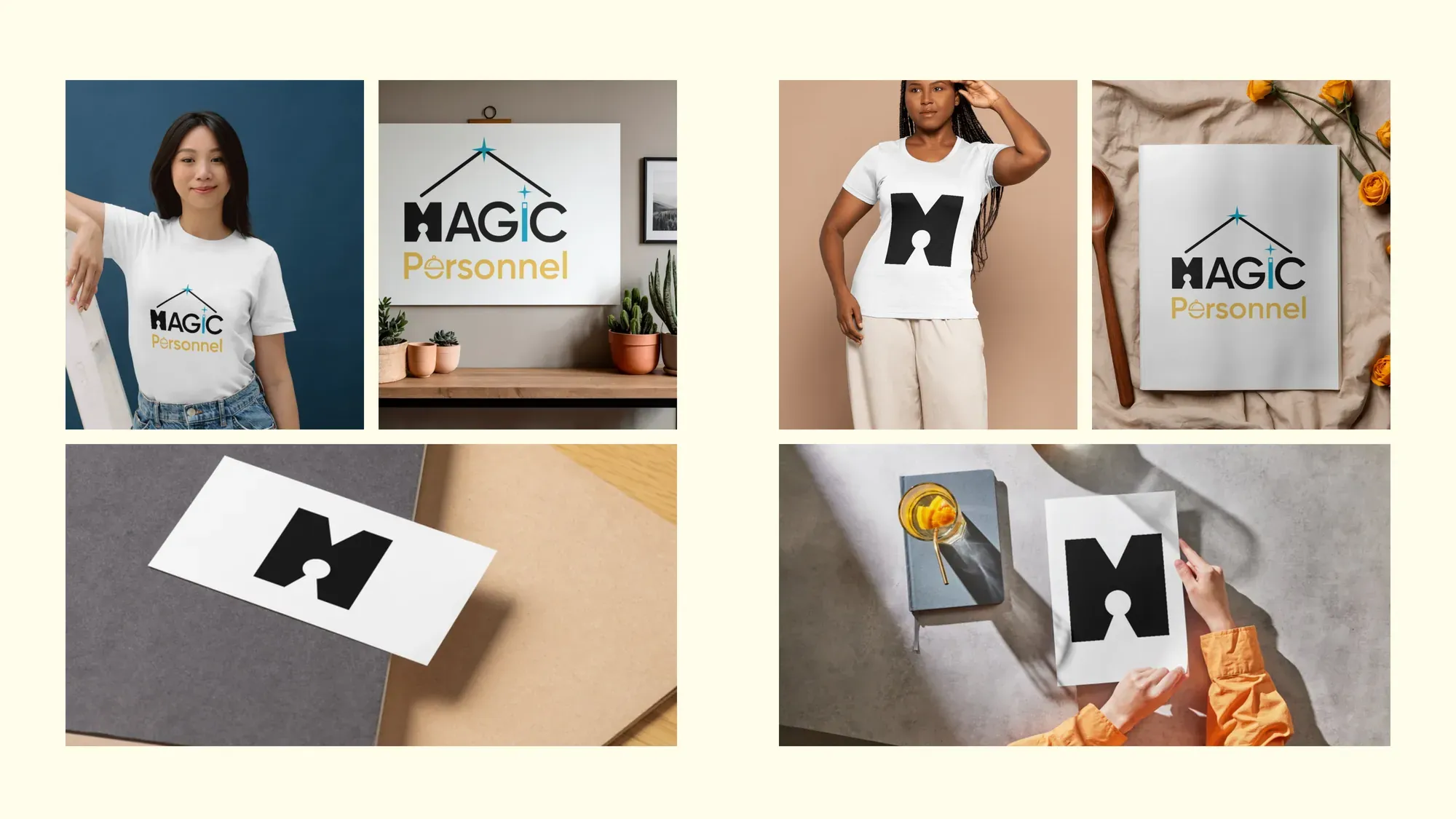
Magic Personnel is a housekeeping and personal assistance business in London. The founder wanted a brand that felt simple and aesthetic, and she already had a logo that worked beautifully.
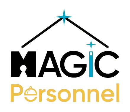
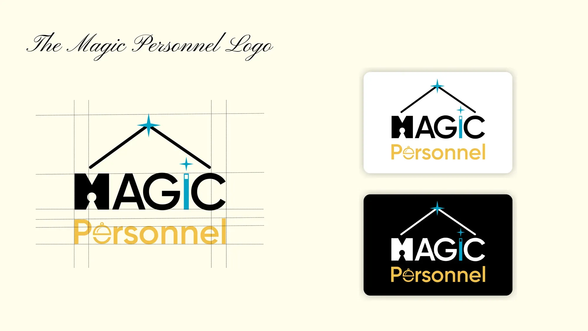
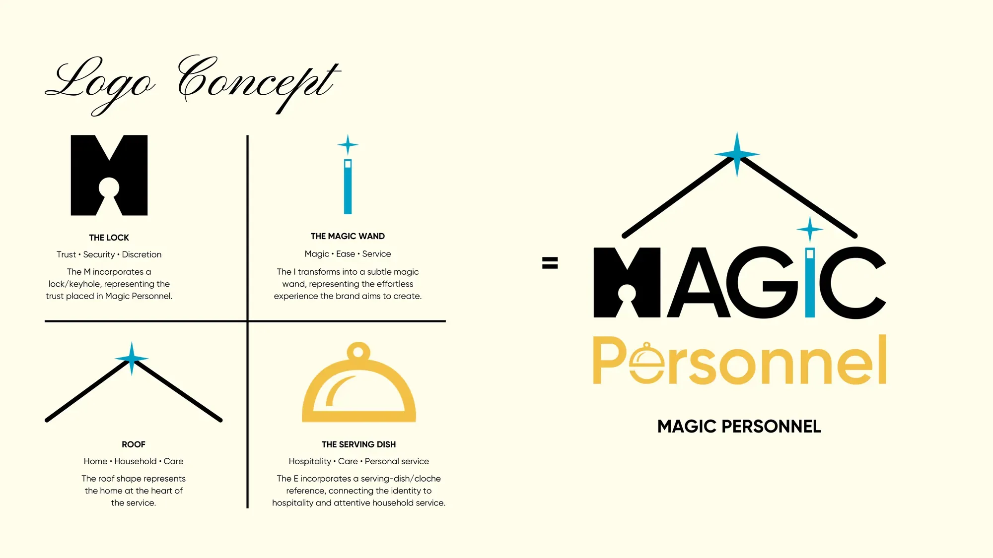
So we didn't start again. We kept the logo and added the small details that tell the story: a keyhole in the M for trust, a wand for the I, a serving cloche in the e for hospitality, and a roof with a spark over the top for home. Easy to miss at first glance, hard to unsee after.
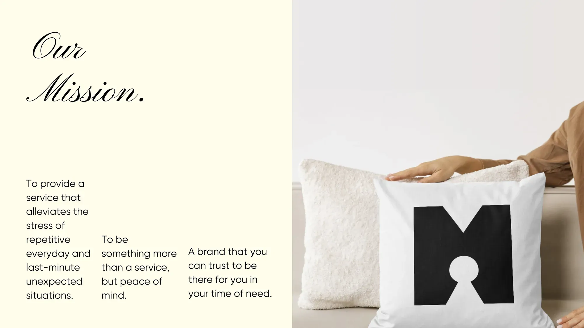
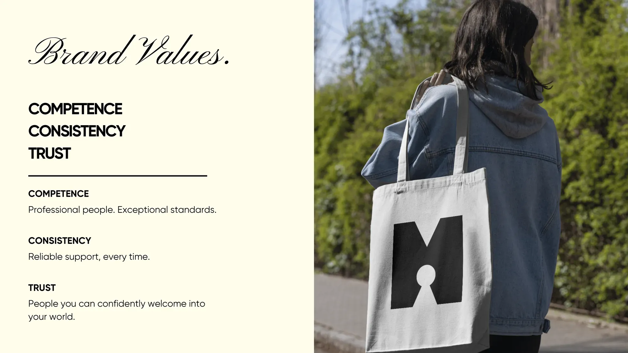
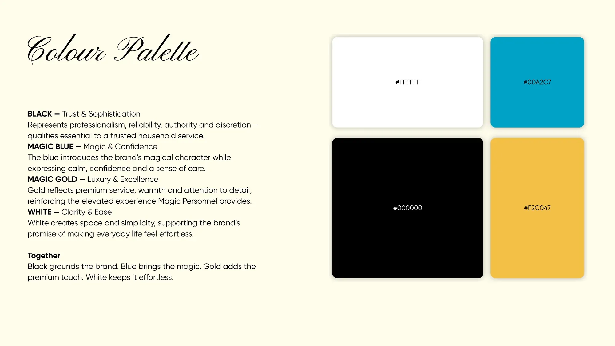
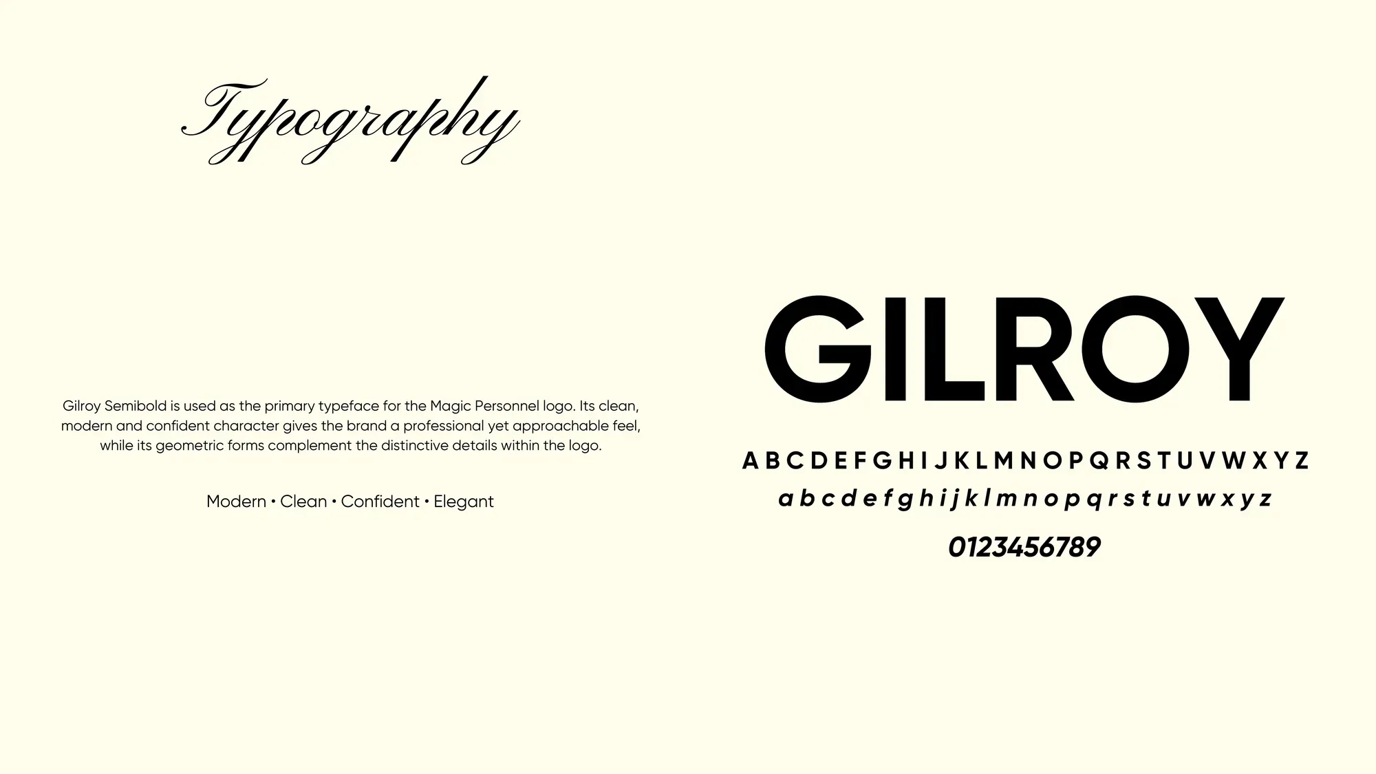
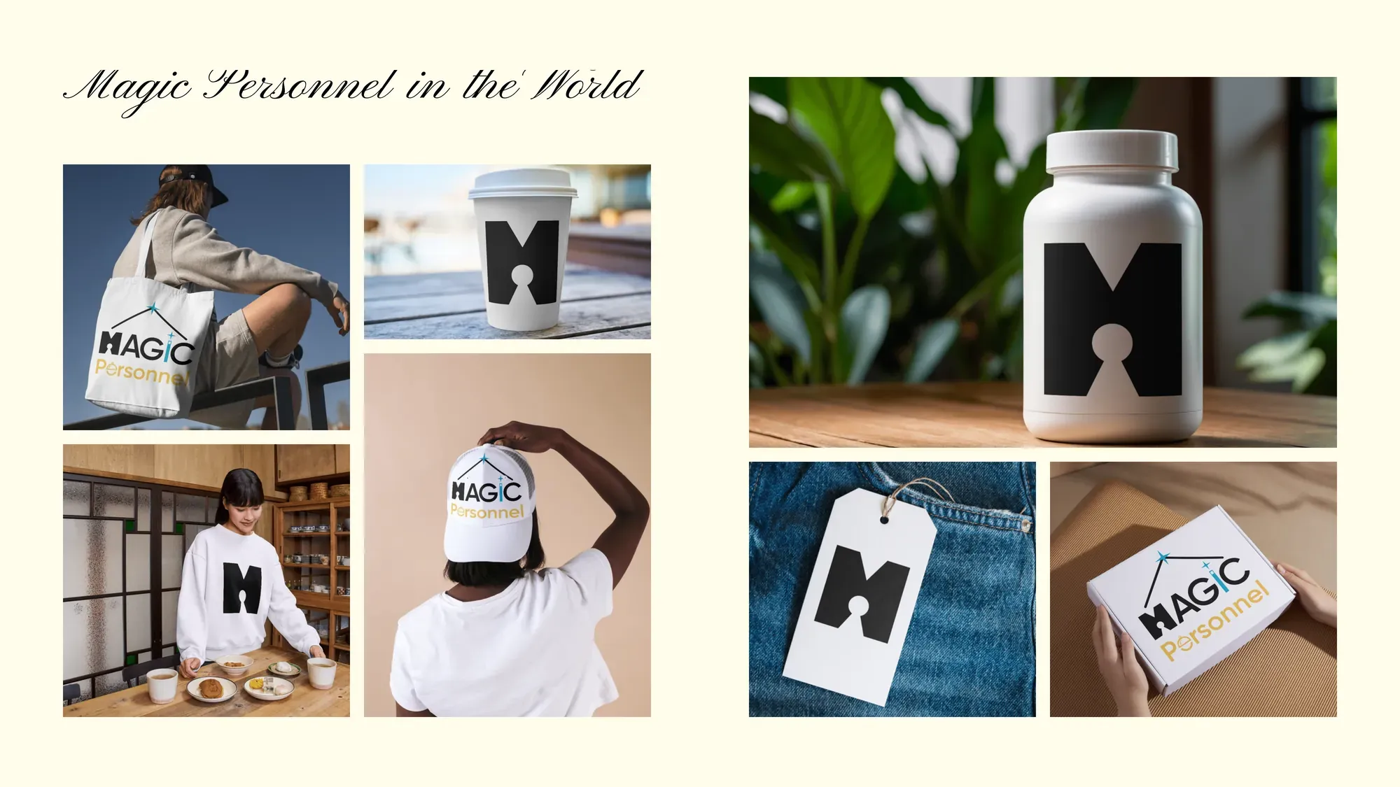
Then we built the rest of the brand around it: a black, blue and gold palette, a clean geometric typeface, and a brand book showing the logo on totes, caps, boxes and print. It is branding for a small business done lightly: respect what already works, and add the details people remember.